


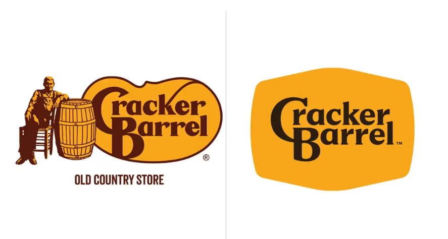
This week Cracker Barrel retired logo of 50 years—the man by the barrel and rocker—and replaced it with a minimalist wordmark. Alongside it came a new campaign tagline: “All the More.”
The result? A brand that looks like it’s running from its roots rather than leaning into them.
The old Cracker Barrel logo wasn’t just a picture; it was a visual hammer. The porch, the rocker, the man leaning on the barrel—it all told you exactly what the brand stood for: comfort, tradition, and Americana.
The new logo is stripped down, corporate, and clean. Minimalism may work for Apple. But for a comfort-food restaurant built on nostalgia, it leaves the brand looking too much like any other casual dining chain.
When evaluating a logo, you need to think strategy first. If your brand positioning is modern, the logo should be modern. If your brand positioning is nostaligic, the logo should reflect that. And the more the better. Duh?
The New Slogan: All the More?
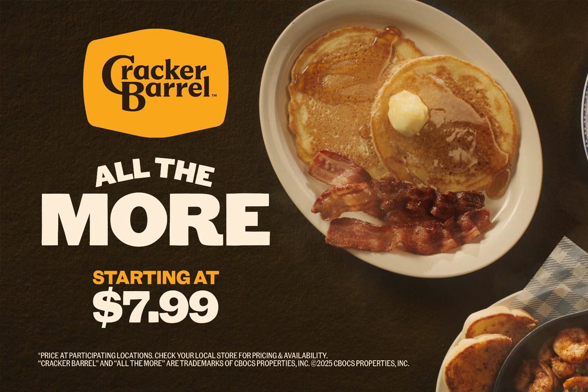
The new slogan “All the More” could be selling anything—insurance, yogurt, ED pills. It doesn’t dramatize Cracker Barrel’s difference, it hides it under corporate fluff.
Strong slogans create contrast. “Finger Lickin’ Good.” “The Ultimate Driving Machine.” “Taste the Rainbow.” These lines don’t just describe—they define and position. “All the More” fails because it is too vague and it doesn’t pass the flip test. “All the Less” isn’t a defined alternative. IHOP seves just as much food on the plate as Cracker Barrel.
The Strategic Enemy: Modern Life and Fast Food
Cracker Barrel’s enemy has always been the fast-food drive-thru and the stress of modern life.
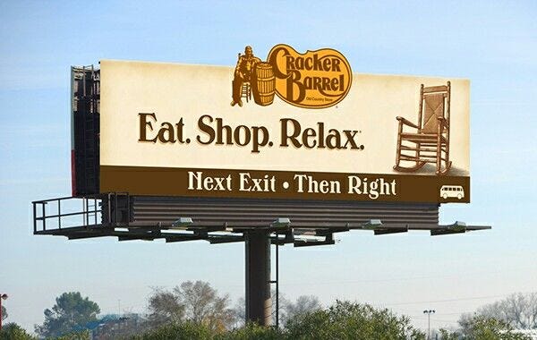
While McDonald’s and Taco Bell promise speed, Cracker Barrel offers pause. While everyday life races by with screens and schedules, Cracker Barrel invites you to slow down on the porch, sip coffee, and reconnect.
That contrast is the essence of positioning and the strategic enemy. Cracker Barrel isn’t just about food—it’s about escape. A meal that feels like a road trip stop, even if you’re just driving home from work.
Lose sight of that enemy, and you lose the brand’s reason for being.
The Better Idea: Make Every Day a Road Trip
“Make Every Day a Road Trip” is miles ahead of “All the More.” Here’s why it could work brilliantly for Cracker Barrel:
It dramatizes escape. A road trip is freedom, discovery, and slowing down—all the things Cracker Barrel represents.
It refinforces the brand. It taps into nostalgia and Americana—core to Cracker Barrel’s DNA
It fights the right enemy. Against the fast-food rush and the chaos of daily life, “Make Every Day a Road Trip” positions Cracker Barrel as the antidote. It's not just a restaurant—it’s a rest stop from modern life.
It ties back to the visual. Rocking chairs, porches, barrels, maps—all reinforce the imagery of a journey worth savoring.
The Lesson: Double Down, Don’t Blend In
The danger of Cracker Barrel’s redesign is that it chases modernity instead of owning timelessness. Consumers don’t want the brand to look like everyone else. They want it to stand for something no one else can.
By abandoning its visual hammer and leaning on a vague slogan, Cracker Barrel is walking away from the story that made it famous. The better move isn’t to soften that difference—it’s to sharpen it.
Because Cracker Barrel’s real power isn’t in being “all the more.” It’s in being the place where you can escape modern life, skip the fast-food window, and make every day feel like a road trip.
Don’t forget to Pre-Order your copy of The Strategic Enemy.


Share this post